We had a very energetic math lesson today! We started out with a look at a probability line and discussing the meaning of these probability words:
impossible, unlikely, equally likely, likely, certain
Students debated the likelihood of various scenarios to demonstrate their understanding of each probability word. Oral language skills were put to good use as students argued their points of view.
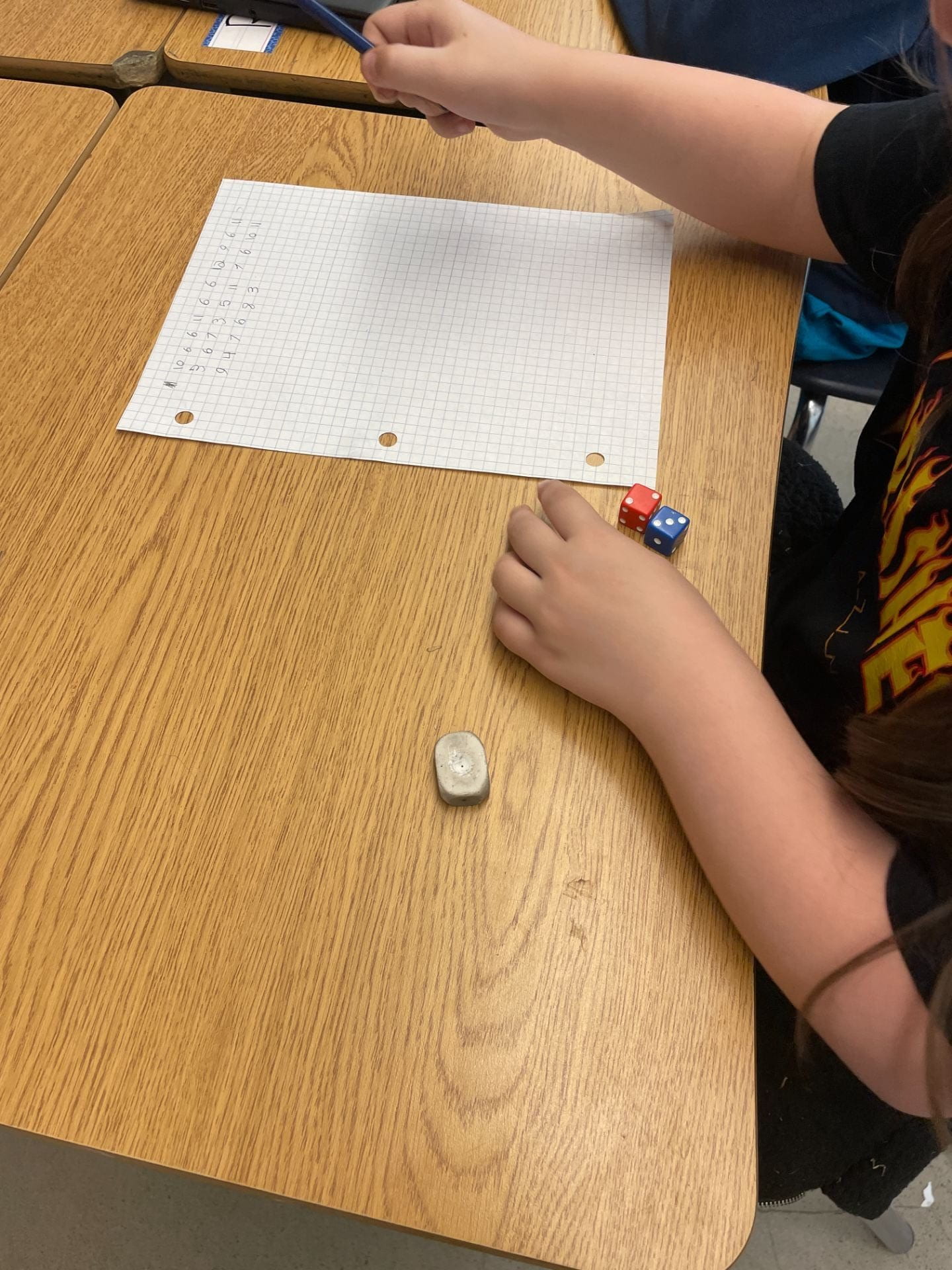
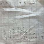
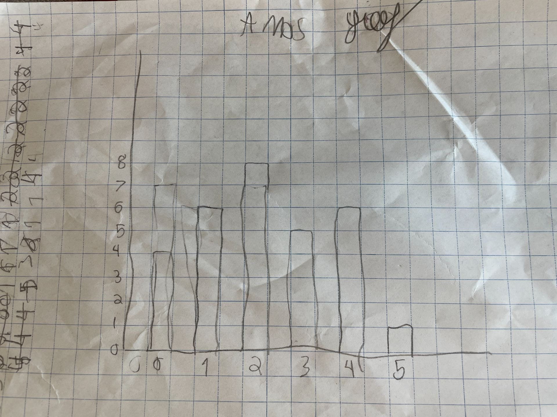
Then, students were given the task of rolling 2 dice 30 times and recording the sum. They worked in pairs to collect their data.
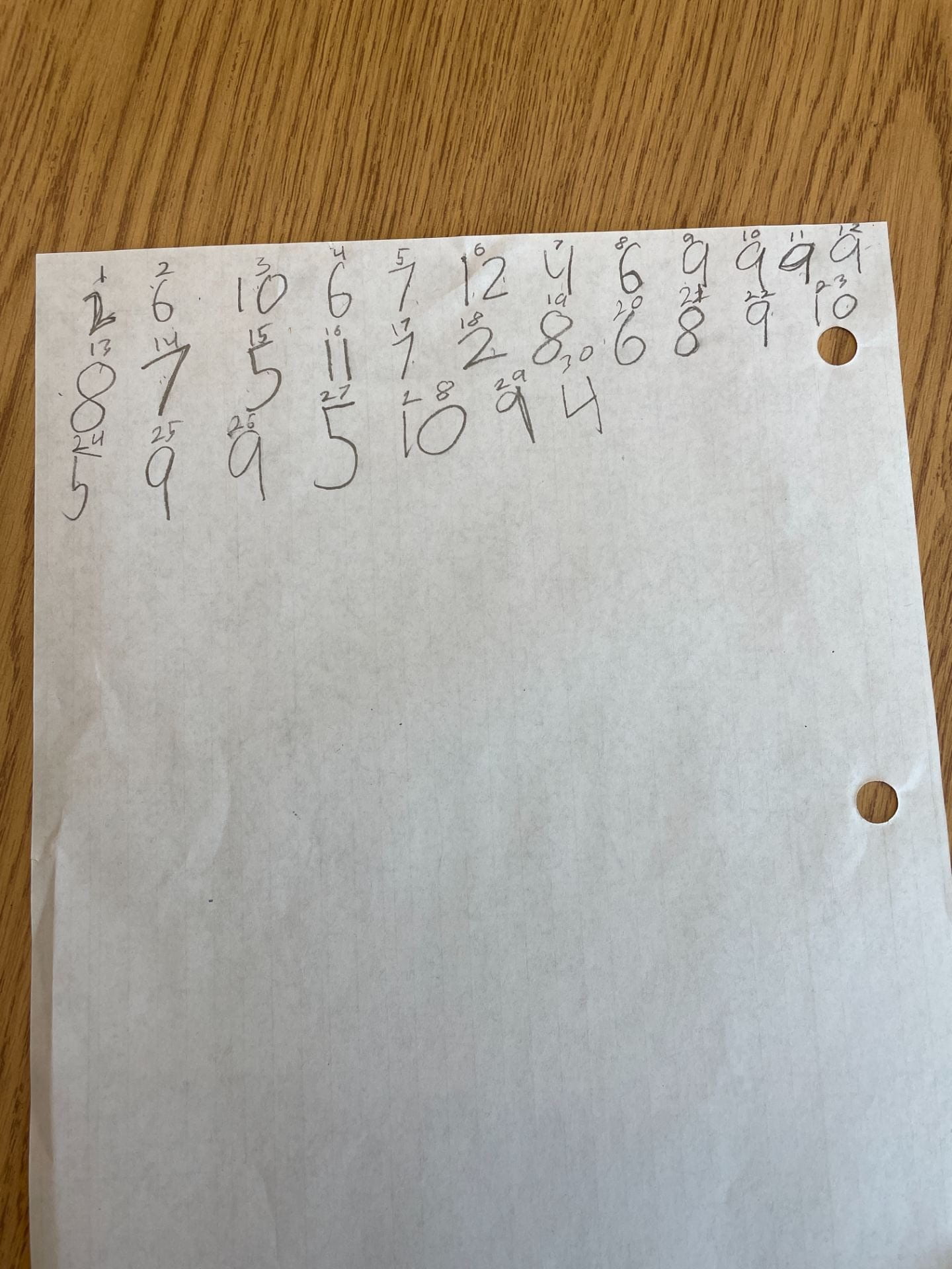
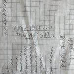
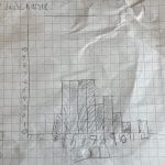
The next task was to choose an appropriate graph to display their data. Some students chose to create a stem and leaf plot with the reasoning that it was quick and easy to do.
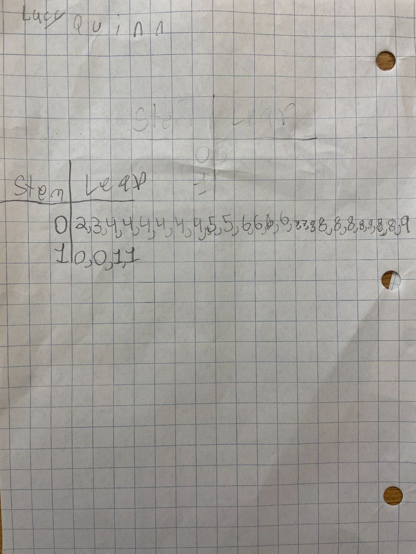
But then, our discussion lead to the conclusion that this was not the best way to display the data as it was difficult to answer questions about the data. Students concluded that a bar graph or a line plot were better choices.
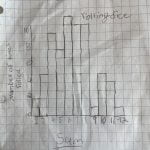
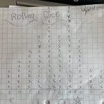
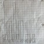
We discussed the similarities in the shape of the data and discovered that the sum of 6 has the greatest chance and the sum of 2 and 12 have the least chance. We created a frequency chart as we investigated the possible dice combinations and students made observations about patterns! It was a very rich discussion!
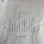
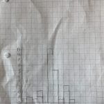
Lastly, as one group had mistakenly recorded differences instead of sums, we turned the mistake into a learning opportunity and we compared their graph to the rest only to discover a similar shape in data!
It was an extremely fun, learning inquiry in math today!